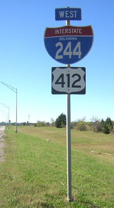
The Interstate shield on this assembly for Interstate 244 and US 412 in Tulsa appears to use the Series E Modified font, compressed to fit within the shield. Because that font starts out being wider than tall, the result is particularly ugly. A better choice would have been Series B, which is designed to be taller than it is wide.
Photo courtesy of David Backlin (taken October 2004)